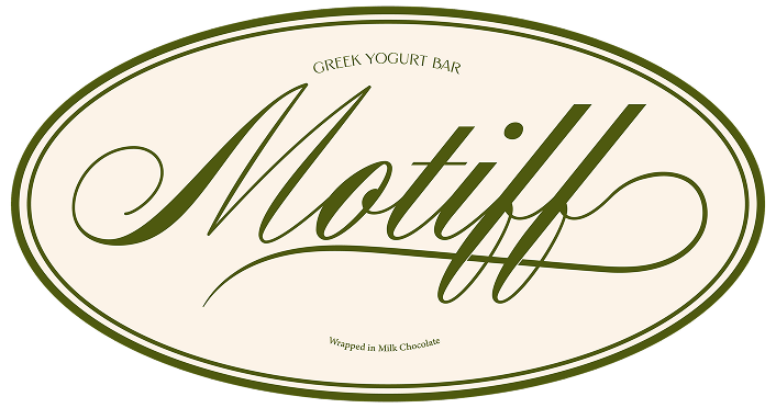
Motiff is a premium confectionery brand built around the idea of blending architecture with indulgence.
The Greek yogurt bar line uses pattern-driven visuals to express flavor, culture, and craft, turning each product into a small architectural “structure” of taste.
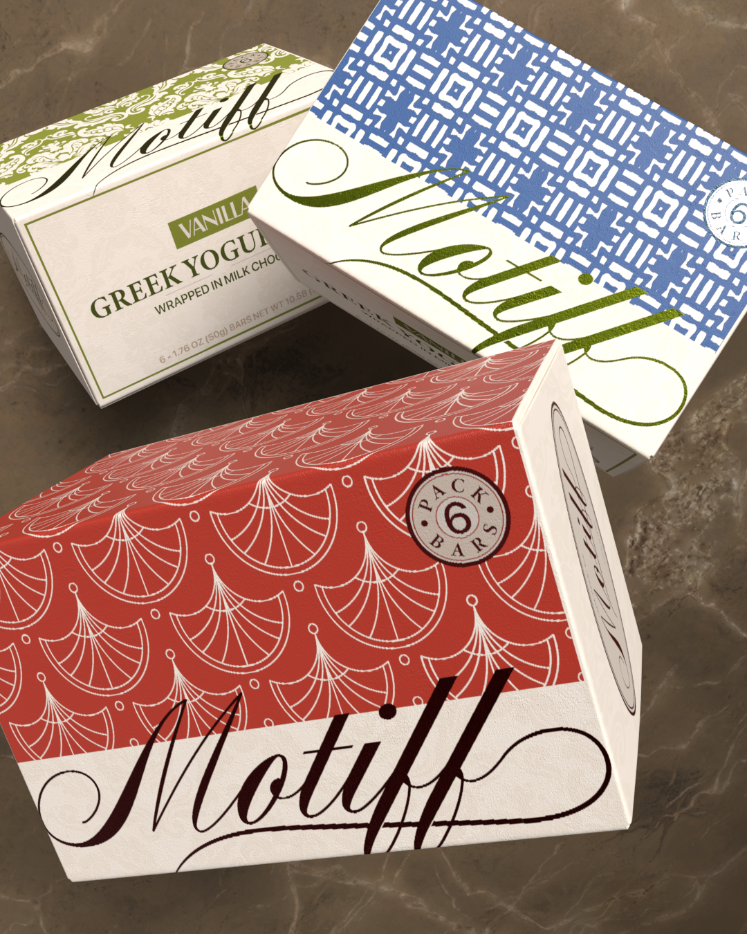
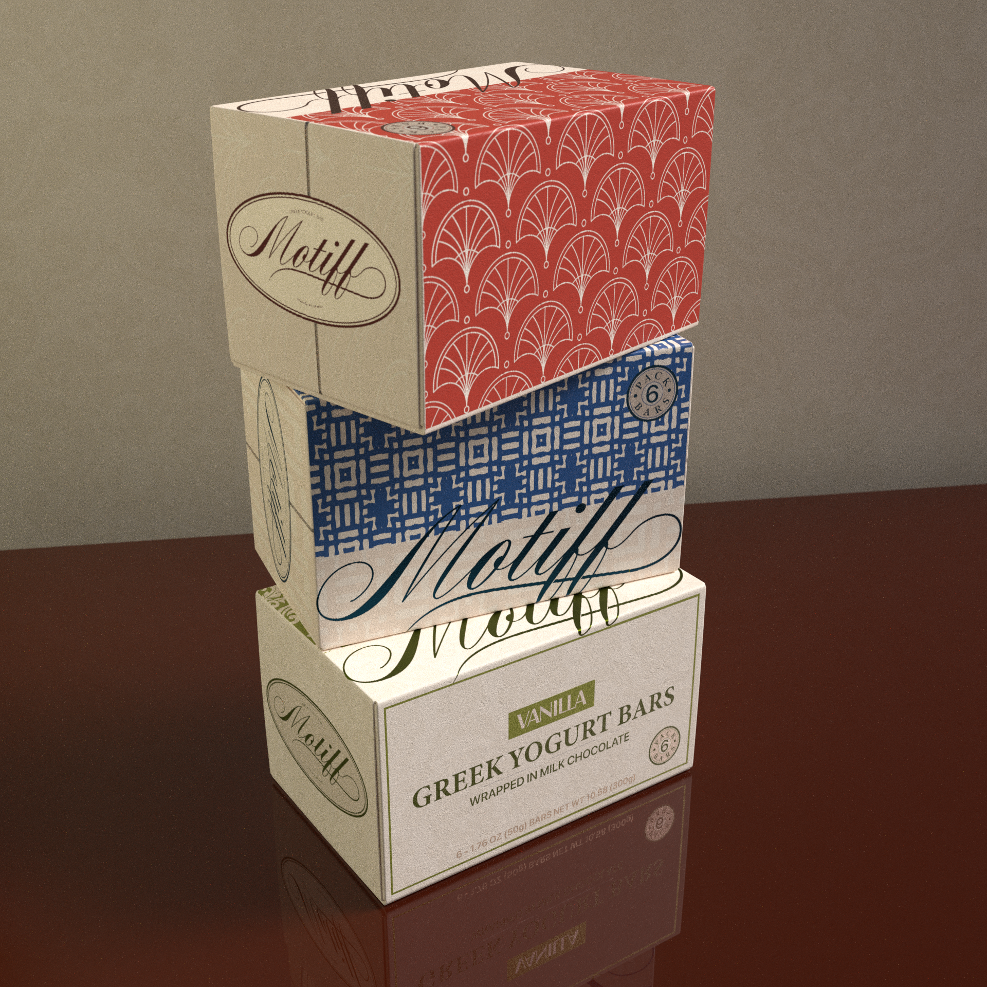
I created a visual language based on decorative motifs found in various architectural traditions. Each flavor received its own unique pattern, combined with a modern, restrained layout and a flowing hand-lettered wordmark to balance structure with softness.
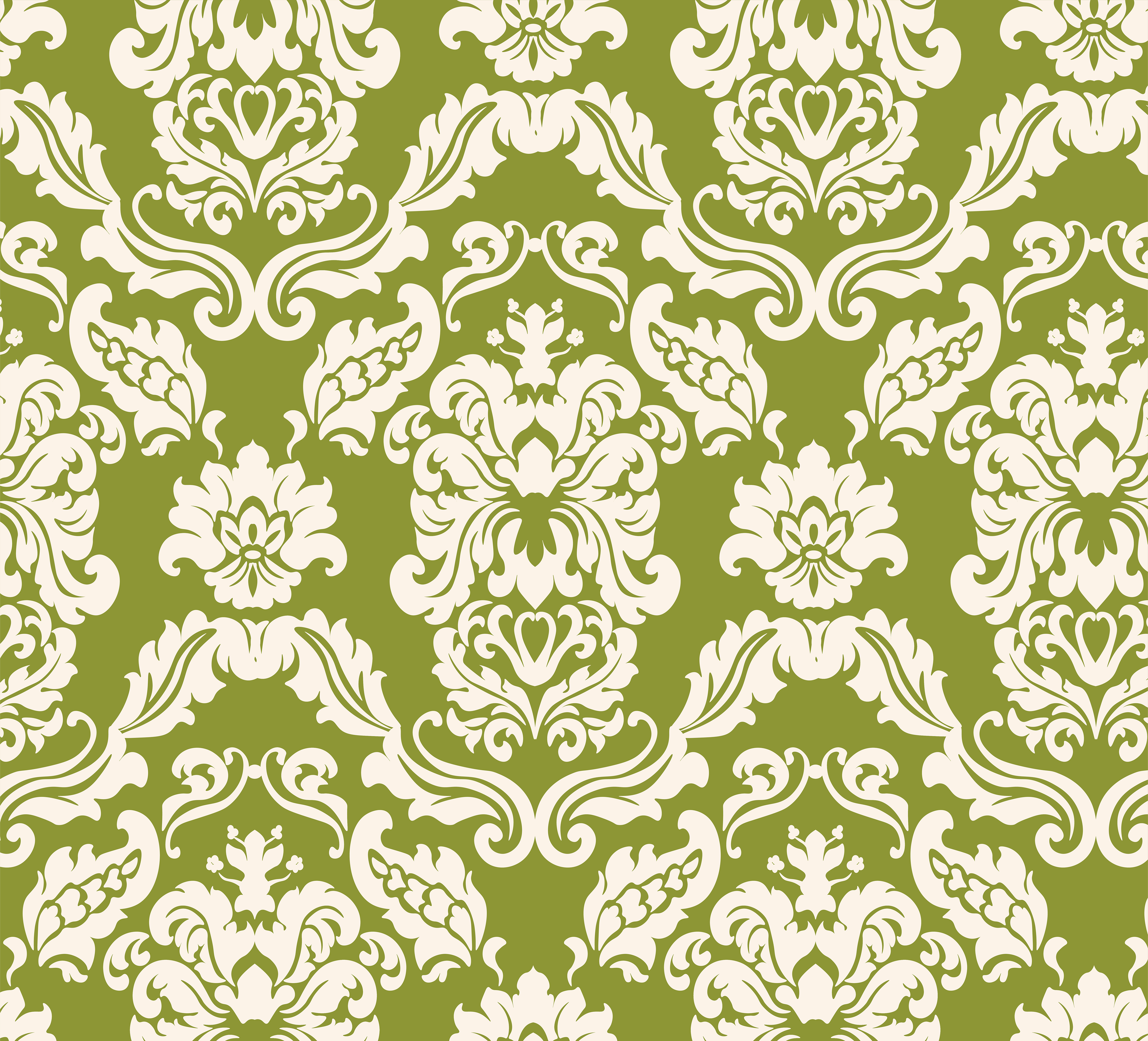
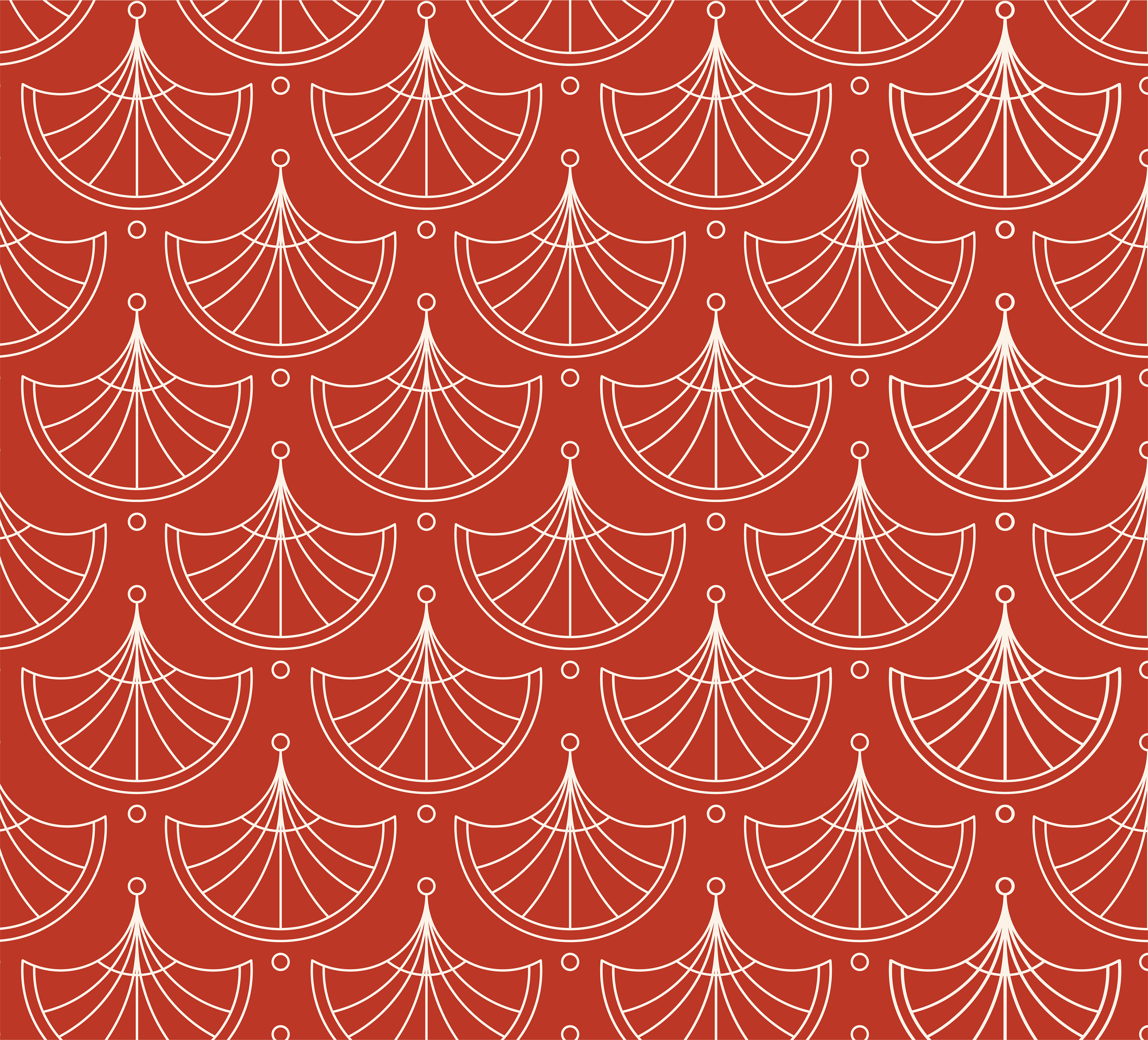
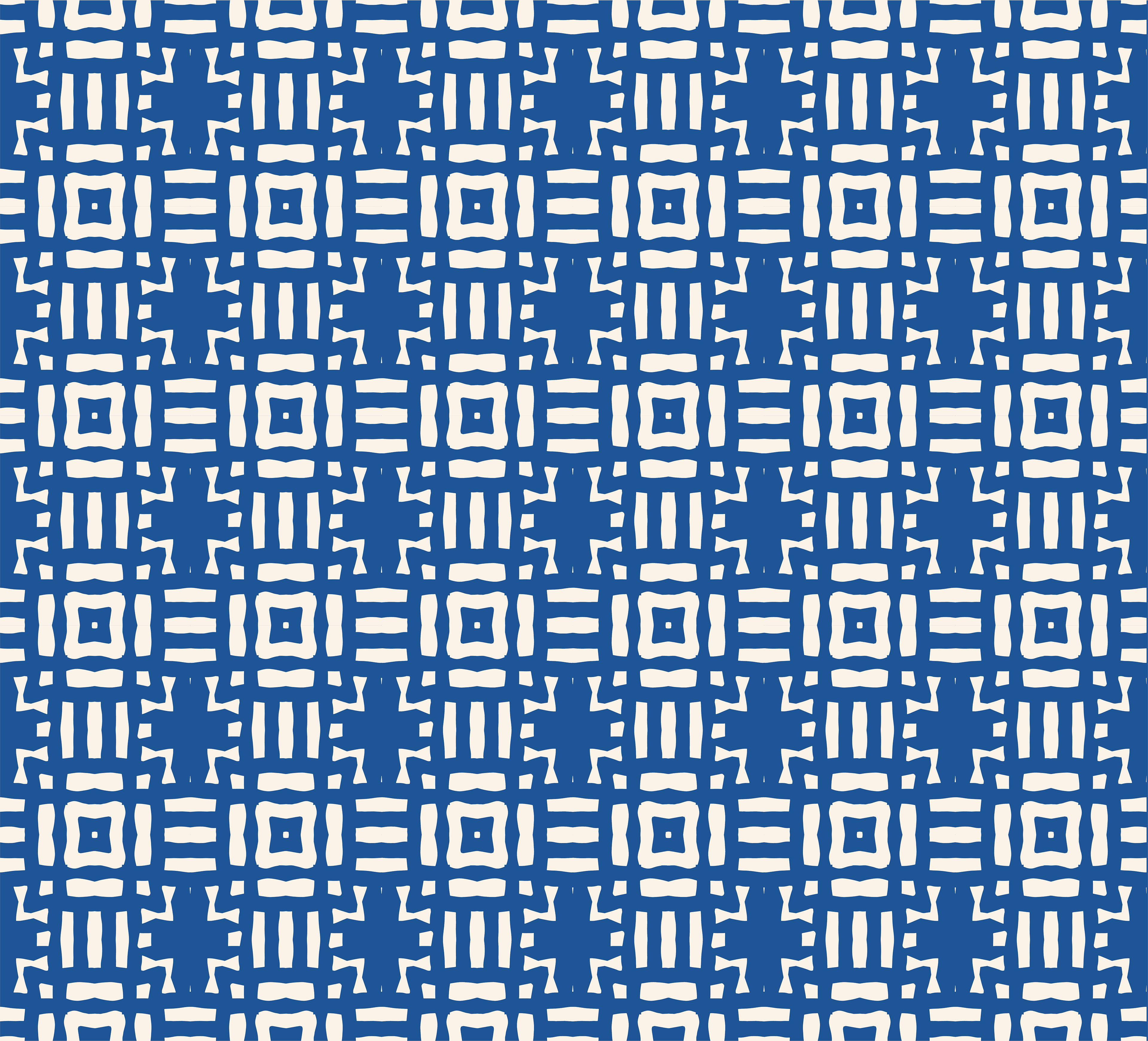
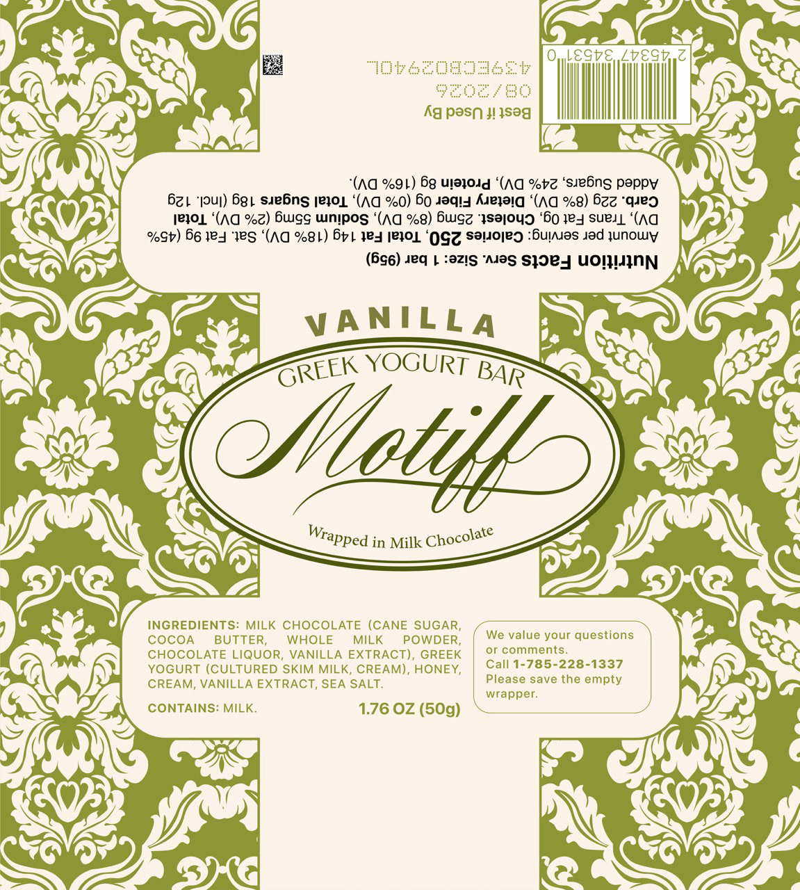
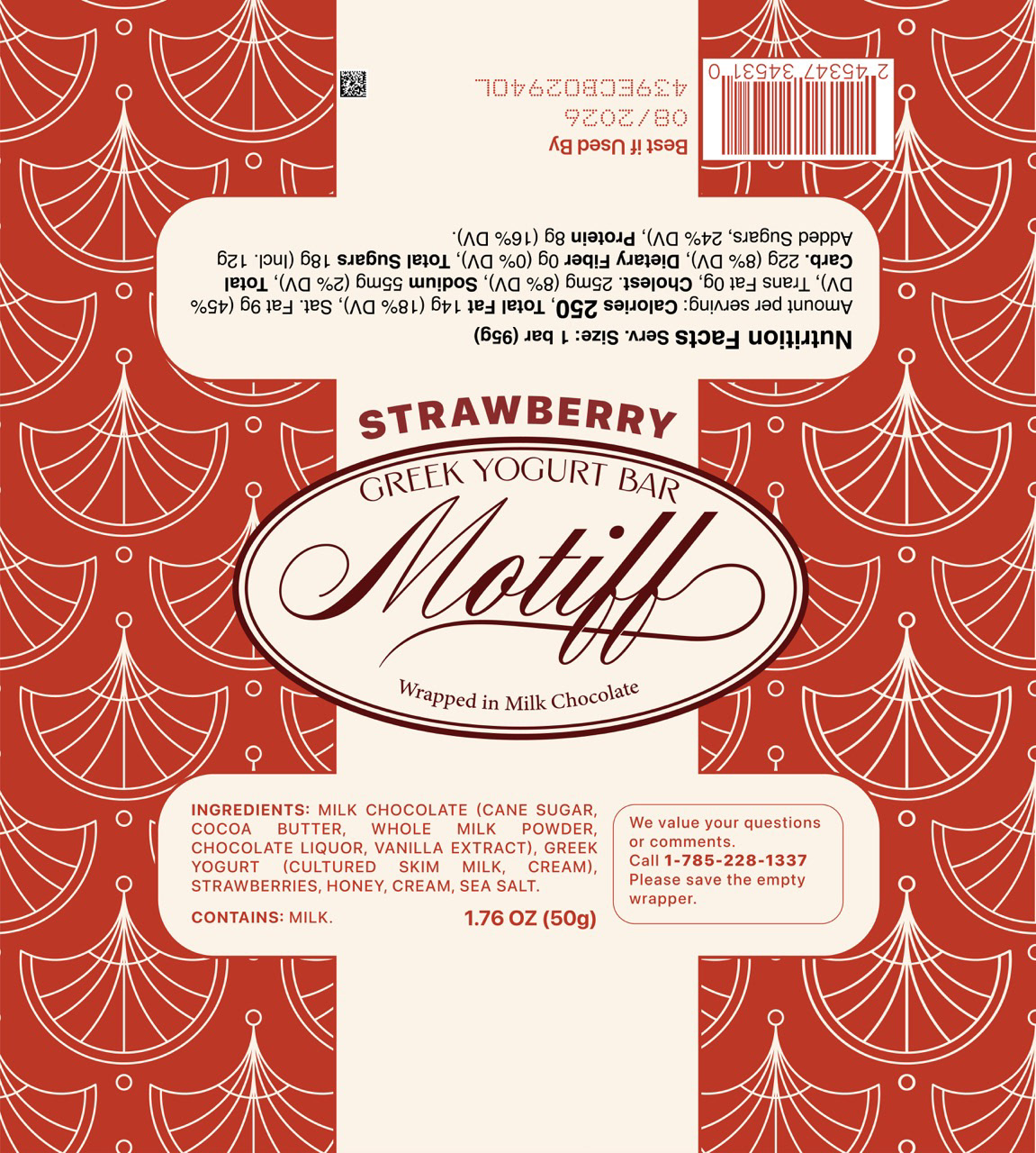
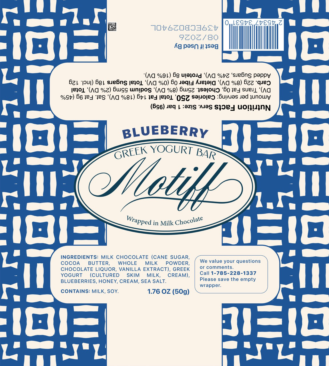
The packaging system was designed to be flexible and scalable. Every wrapper and box follows the same framework—patterned upper half, minimal lower half, and centered branding—allowing new flavors to be added easily while keeping the identity cohesive.
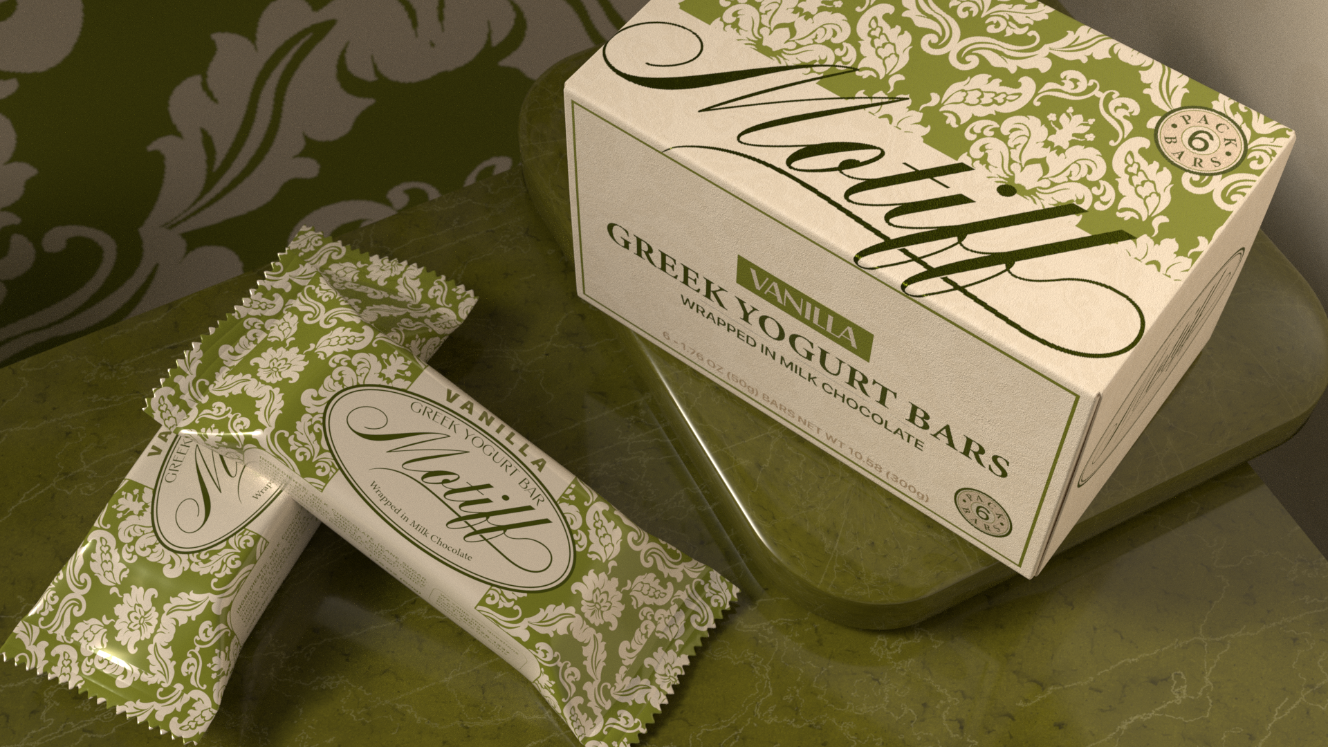
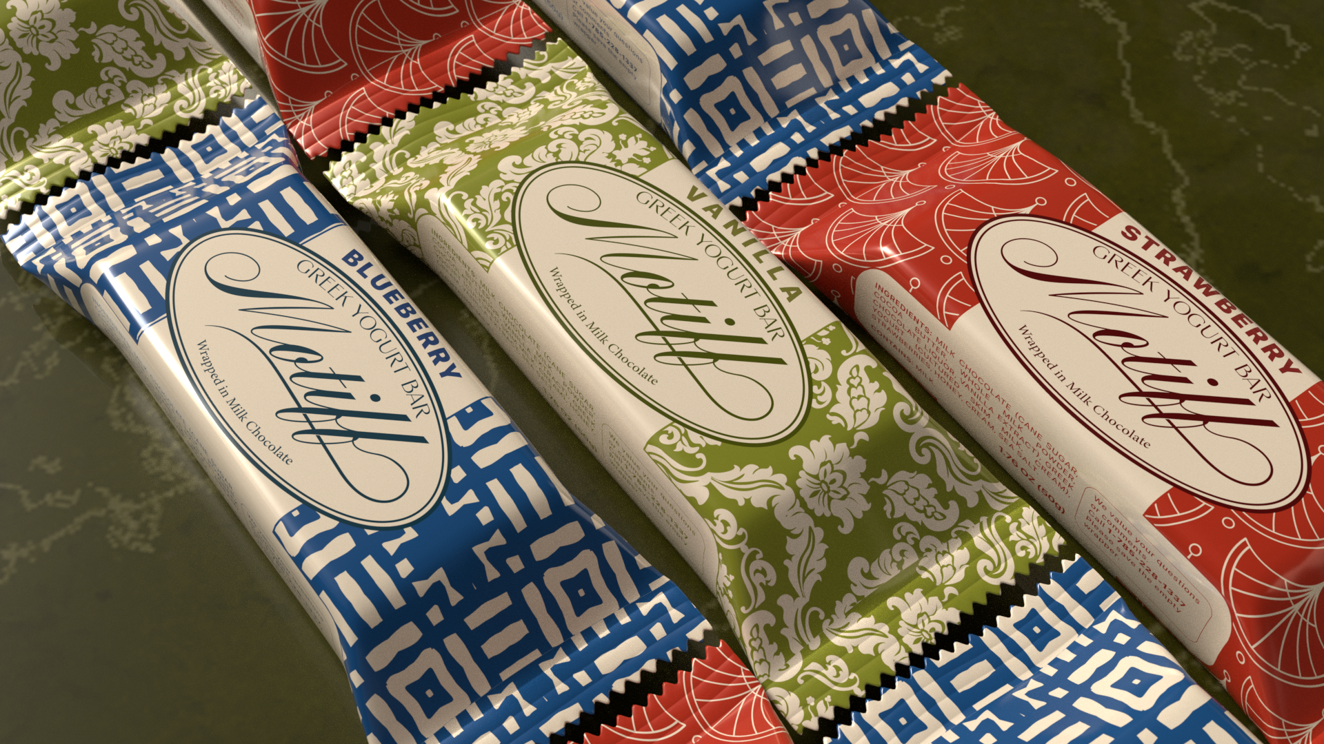
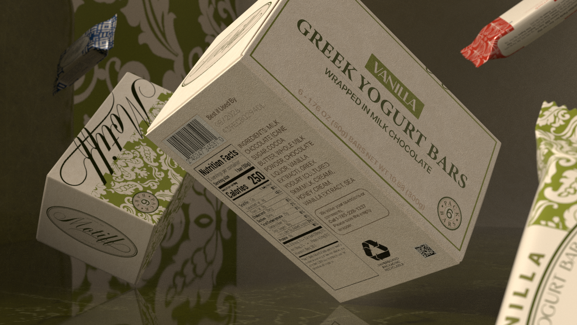

Muted colors, natural textures, and generous whitespace help establish a calm, luxurious tone that stands apart from the loud, playful style of most snack packaging. The overall feel is modern, intentional, and crafted for an audience that values design as much as flavor.
The final packaging presents a strong, unified identity across multiple SKUs, offering clear flavor distinction and a premium shelf presence. The system highlights Motiff’s core message—beauty, precision, and mindful indulgence—while leaving room for future product expansion.